

CSS 圆角是使用 border-radius 属性创建的。此属性允许您指定元素的外部边框边缘的角的半径。
可能的值
<length>:使用长度值表示圆半径的大小。负值无效。
<percentage>:使用百分比值表示圆半径的大小。
- 水平轴百分比是指盒子的宽度。
- 垂直轴百分比是指盒子的高度。
- 负值无效。
适用于
所有 HTML 元素,但 border-collapse 设置为 collapse 的 table 和 inline-table 元素除外。适用于 ::first-letter。
DOM 语法
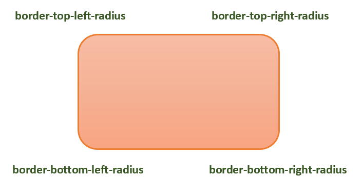
下图演示了不同的边框半径角以供参考:
下表显示了圆角的可能值,如下所示:
| 值 | 描述 | |
|---|---|---|
| radius |  |
是一个 <length> 或 <percentage>,用于设置元素的所有四个角的半径。它仅在单值语法中使用。 |
| top-left and bottom-right |  |
<length> 或<percentage> ,用于设置元素的左上角和右下角的半径。它仅在双值语法中使用。 |
| top-right and bottom-left |  |
<length> 或<percentage> ,用于设置元素的右上角和左下角的半径。它仅在两个值和三个值语法中使用。 |
| top-left |  |
<length> 或<percentage> ,用于设置元素左上角的半径。它用于三个和四个值语法。 |
| top-right |  |
<length> 或<percentage>,用于设置元素右上角的半径。它仅在四值语法中使用。 |
| bottom-right |  |
<length> 或<percentage> ,用于设置元素右下角的半径。它仅在三个值和四个值语法中使用。 |
| bottom-left |  |
<length> 或<percentage>,用于设置元素左下角的半径。它仅在四值语法中使用。 |
单个边框半径属性(如 border-top-left-radius)不能继承自其父元素。相反,您必须使用各个 longhand 属性来设置每个角的边框半径。
CSS 边框半径 - 长度值
以下示例演示了如何使用 border-radius 属性为框的所有四个角创建圆角 -
您可以使用 border-radius 属性在框、边框和图像上创建圆角。
这是一个例子 -
您可以使用 border-radius 属性在元素上创建不同的圆角样式。
这是一个例子 -
CSS 圆角图像
您可以使用 border-radius 属性在元素上创建不同的圆角样式。
这是一个例子 -
我们可以使用 CSS border-radius 属性创建一个圆和一个椭圆。
这是一个例子 -
CSS border-radius - 相关属性
以下是与 border-radius 相关的 CSS 属性列表:
| 属性 | 描述 |
|---|---|
| border-top-left-radius | 设置元素边框左上角的圆度。 |
| border-top-right-radius | 设置元素边框右上角的圆度。 |
| border-bottom-right-radius | 设置元素边框右下角的圆度。 |
| border-bottom-left-radius | 设置元素边框左下角的圆度。 |
| border-start-start-radius | 设置元素边框的块开始角和内联开始角的圆度。 |
| border-start-end-radius | 设置元素边框的块开始角和内联结束角的圆度。 |
| border-end-start-radius | 设置元素边框的块端角和内联开始角的圆度。. |
| border-end-end-radius | 设置元素边框的块端角和内联端角的圆度。 |
