CSS inline-block 属性用于将元素显示为内联级别的块容器。内联块元素不会从新行开始,但可以将它们设置为特定的宽度和高度。
以下是 inline-block 属性的一些特征:
- 该元素将与其他内联元素显示在同一行上。
- 该元素将具有宽度和高度,但默认情况下它没有边距或填充。
- 元素可以浮动或定位。
- 可以清除元素中的浮点数。
display: inline-block 属性是 display: inline 和 display: block 属性的组合。它不仅允许元素表现得像内联元素,而且还能够像块元素一样占用行上的空间。
display: inline, display: block 和 display: inline-block: 之间的区别:
inline(内嵌) | block(块) | inline-block(内联块) |
---|---|---|
该元素显示在同一行上。 | 该元素将显示在新行上。 | 该元素显示在同一行 上。 |
它不会占据容器的整个宽度。 | 它占据了容器的整个宽度。 | 它不会占据容器的整个宽度。 |
默认情况下,它没有边距或填充。 | 默认情况下,它具有边距和填充。 | 默认情况下,它具有边距和填充。 |
下图显示了内联、块和内联块元素的不同布局行为:
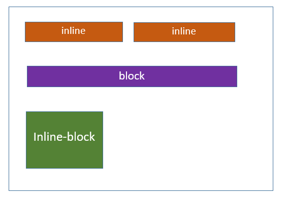
CSS 内联块 - 具有不同的行为
以下示例演示了显示的不同行为:inline、display: block 和 display: inline-block properties:
<html>
<head>
<style>
.display-inline {
display: inline;
background-color: #1f9c3f;
border: 2px solid #000000;
color: #ffffff;
padding: 5px;
text-align: center;
}
.display-block {
display: block;
background-color: #1f9c3f;
border: 2px solid #000000;
color: #ffffff;
padding: 5px;
height: 30px;
text-align: center;
}
.display-inline-block {
display: inline-block;
background-color: #1f9c3f;
border: 2px solid #000000;
color: #ffffff;
padding: 5px;
height: 30px;
text-align: center;
}
</style>
</head>
<body>
<h2>Display Inline</h2>
<div>There are many variations of passages of Lorem Ipsum available,
<span class="display-inline">Tutorialspoint</span> ,
by injected humour, or randomised words which don't
look even slightly believable.</div>
<h2>Display Block</h2>
<div>There are many variations of passages of Lorem Ipsum available,
<span class="display-block">Tutorialspoint</span> ,
by injected humour, or randomised words which don't
look even slightly believable.</div>
<h2>Display Inline Block</h2>
<div>There are many variations of passages of Lorem Ipsum available,
<span class="display-inline-block">Tutorialspoint</span> ,
by injected humour, or randomised words which don't
look even slightly believable.</div>
</body>
</html>
CSS 内联块 - 导航链接
inline-block 属性用于创建水平导航菜单或列表,其中每个导航项 显示为块级元素,但与其他项保持内联。
<html>
<head>
<style>
ul {
list-style-type: none;
margin: 0;
padding: 15px;
background-color: #1f9c3f;
}
li {
display: inline-block;
}
a {
padding: 10px;
color: rgb(247, 247, 247);
}
</style>
</head>
<body>
<ul>
<li><a href="#">Tutorialspoint</a></li>
<li><a href="#">Home</a></li>
<li><a href="#">Articles</a></li>
<li><a href="#">Courses</a></li>
<li><a href="#">About us</a></li>
</ul>
</body>
</html>
CSS 内联块 - 按钮组
您可以使用 inline-block 属性创建水平显示的按钮组。这 按钮将在同一行上一起显示,并且它们将具有特定的宽度和高度。
<html>
<head>
<style>
.button-group {
display: inline-block;
background-color: #ef4343;
}
button {
padding: 10px;
margin: 10px;
background-color: #1f9c3f;
border: none;
color: #ffffff;
width: 80px;
height: 40px;
}
</style>
</head>
<body>
<div class="button-group">
<button>Submit</button>
<button>Cancel</button>
<button>Reset</button>
</div>
</body>
</html>
CSS 内联块 - 图像和文本
inline-block 属性使图像和跨度显示在同一行上,从而允许它们 在块内水平对齐。
<html>
<head>
<style>
div {
display: inline-block;
}
img {
width: 100px;
height: 100px;
}
span {
padding: 10px;
}
</style>
</head>
<body>
<div>
<img src="images/tutimg.png" alt="Image">
<span>Tutorialspoint</span>
</div>
</body>
</html>
CSS 内联块 - 进度条
我们可以使用 inline-block 属性创建进度条。此属性与其他内联元素显示在同一行上。
<html>
<head>
<style>
.progress-bar {
display: inline-block;
width: 100%;
height: 25px;
background-color: blue;
border-radius: 15px;
overflow: hidden;
}
.progress-bar-fill {
width: 70%;
background-color: #1f9c3f;
height: 100%;
}
</style>
</head>
<body>
<div class="progress-bar">
<div class="progress-bar-fill"></div>
</div>
</body>
</html>